A Bold Brand Identity for Kwe Logistics
A Bold Brand Identity for Kwe Logistics
Client
Kwe Logistics
Year
2024
Deliverables
Logo, brand identity, flyer design, marketing materials
KWE Logistics Services set out to redefine bike delivery in Nigeria, aiming to establish a reputation as a fast, secure, and reliable partner for businesses and individuals. With a clear vision in mind, they approached me to craft a brand identity that would encapsulate these values while standing out in a highly competitive market.
KWE Logistics Services set out to redefine bike delivery in Nigeria, aiming to establish a reputation as a fast, secure, and reliable partner for businesses and individuals.
With a clear vision in mind, they approached me to craft a brand identity that would encapsulate these values while standing out in a highly competitive market.
The Challenge: Translating Vision into Design
The client’s vision was straightforward—create a brand identity that speaks to speed, trust, and dependability. While they gave me complete creative freedom, the challenge was to ensure the design effectively communicated their goals and resonated with their target audience.
The client’s vision was straightforward—create a brand identity that speaks to speed, trust, and dependability.
While they gave me complete creative freedom, the challenge was to ensure the design effectively communicated their goals and resonated with their target audience.


A Thoughtful, Cohesive Brand Identity
A Thoughtful, Cohesive Brand Identity
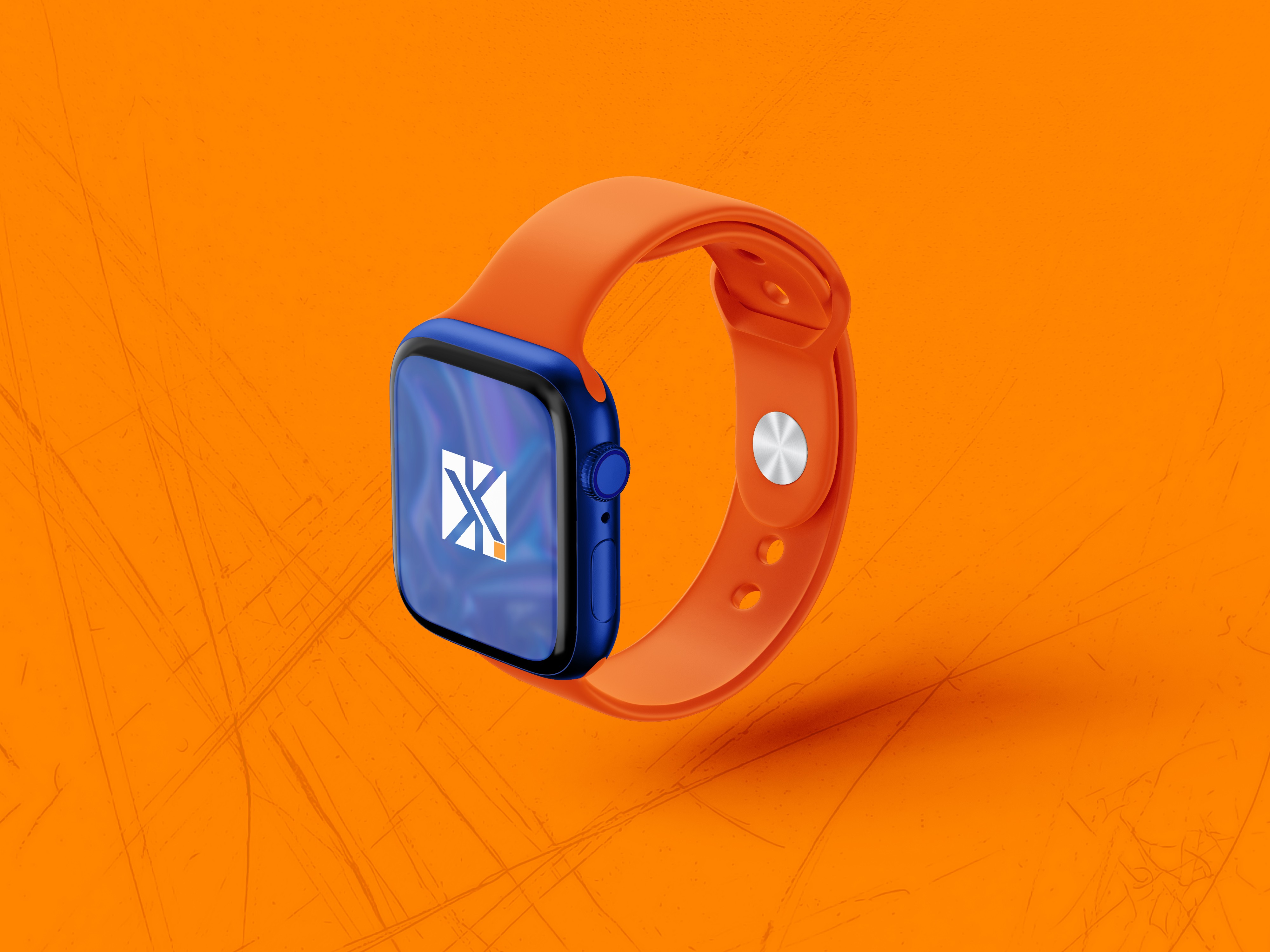
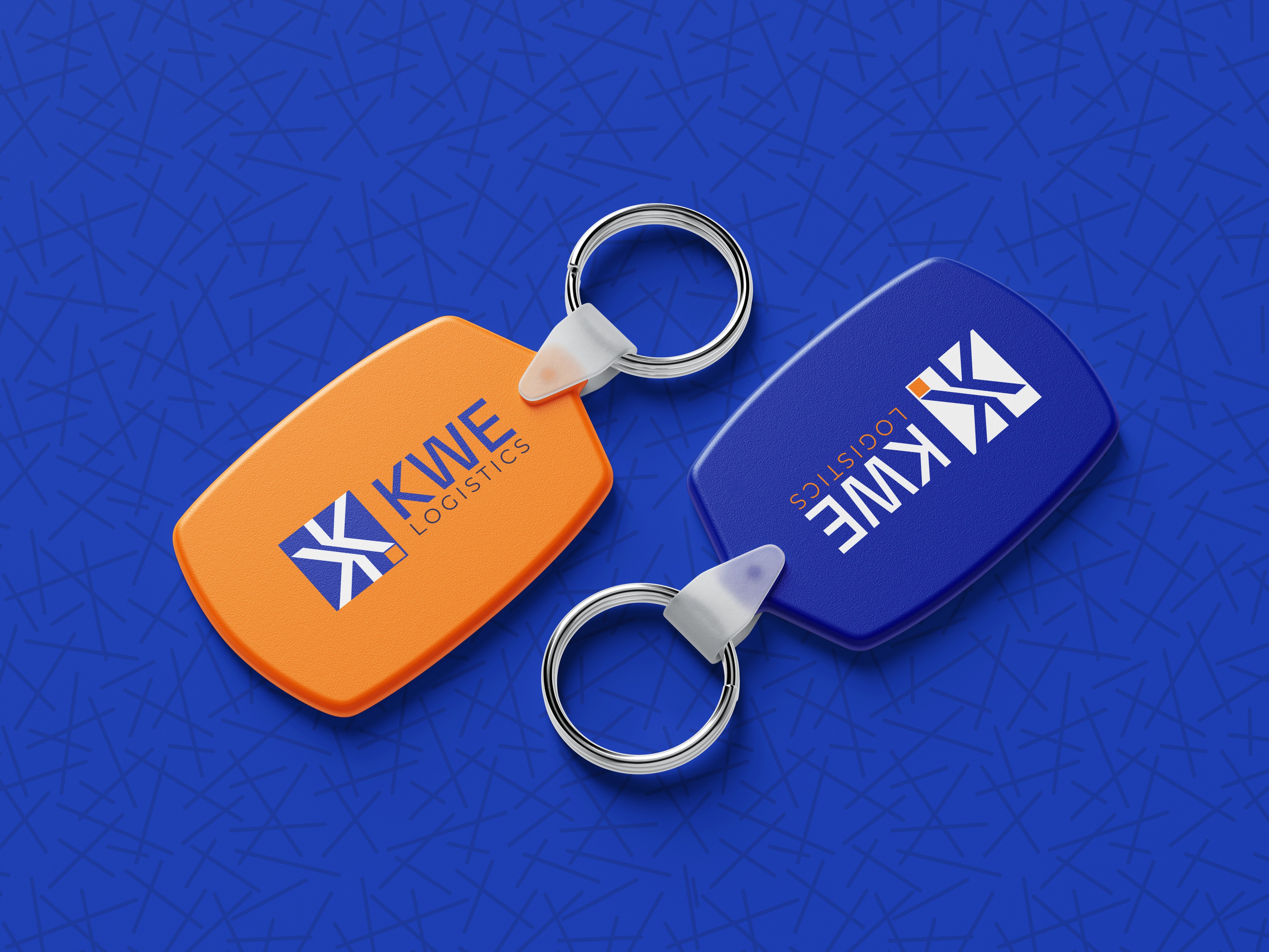
Logo Design
The logo was designed to be simple yet powerful, telling a story of speed, security, and precision.
Two Ks Facing Each Other: Represent the company’s commitment to safeguarding packages from sender to recipient.
Directional Arrows: Capture the essence of speed and efficiency in every delivery.
Orange Box: Symbolizes a securely delivered package at its final destination.
The client’s trust in my process allowed me to craft a logo that was both meaningful and visually striking.
The logo was designed to be simple yet powerful, telling a story of speed, security, and precision.
Two Ks Facing Each Other: Represent the company’s commitment to safeguarding packages from sender to recipient.
Directional Arrows: Capture the essence of speed and efficiency in every delivery.
Orange Box: symbolizes a securely delivered package at its final destination.
The client’s trust in my process allowed me to craft a logo that was both meaningful and visually striking.

The client’s trust in my process allowed me to craft a logo that was both meaningful and visually striking.

Color Palette
The colors were selected to align with KWE Logistics’ values:
Blue: A universal symbol of trust and professionalism, reinforcing reliability.
Orange: Adds energy, enthusiasm, and dynamism, reflecting the high-energy service offered by their bikers. Together, the palette strikes a balance between dependability and vibrancy, making the brand approachable yet professional.

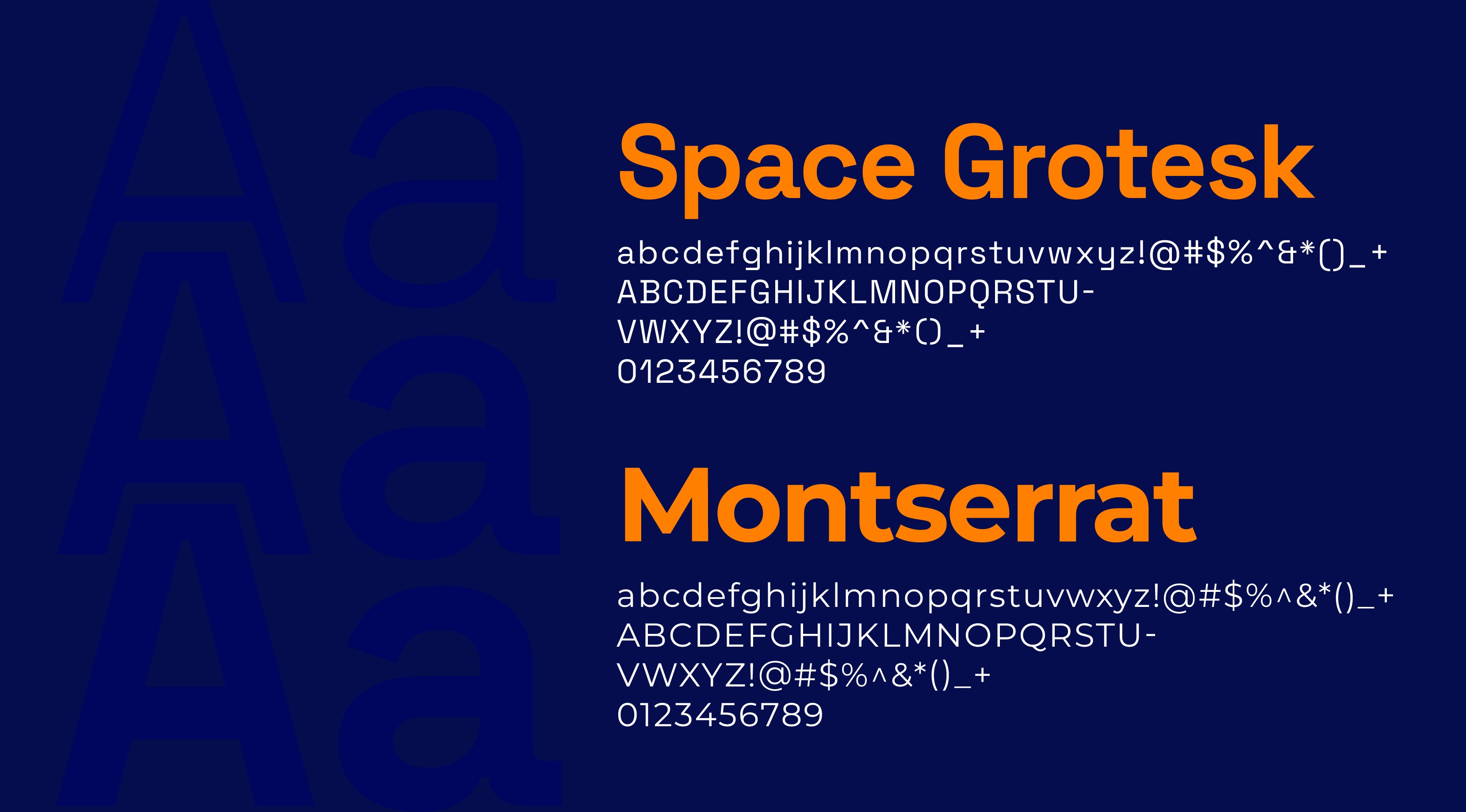
Font
The choice of fonts contributed significantly to the brand’s clean and modern identity.
Space Grotesk: Used for its sleek, geometric style, emphasizing modernity and clarity.
Montserrat: A versatile, professional font that reinforced readability and accessibility across materials.
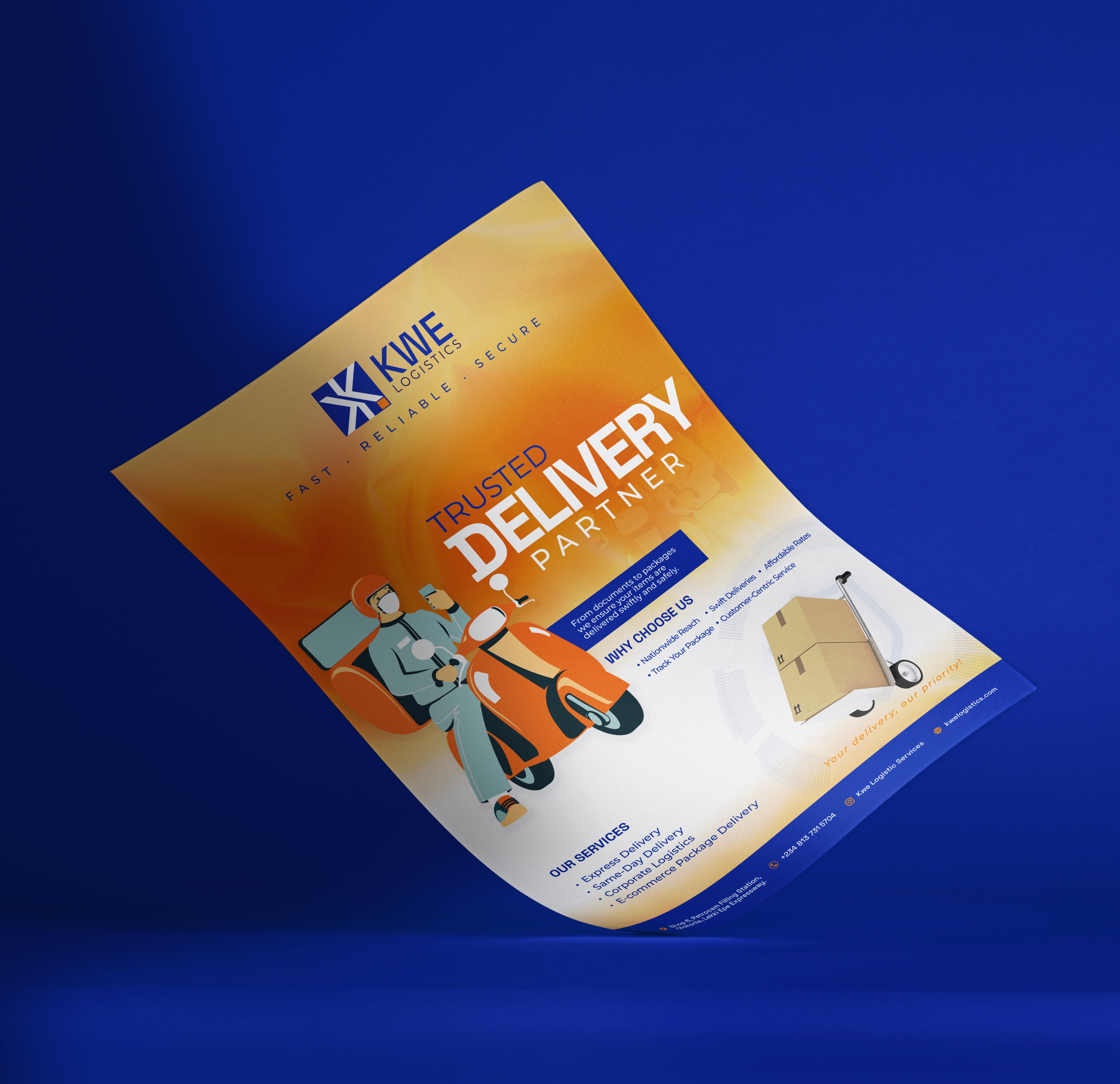
Marketing Materials: Flyers and Outdoor Banners
To ensure a cohesive brand presence, I designed an array of materials that extended the brand’s identity across all touchpoints.
Staff shirts: strengthening internal brand culture and external visibility.
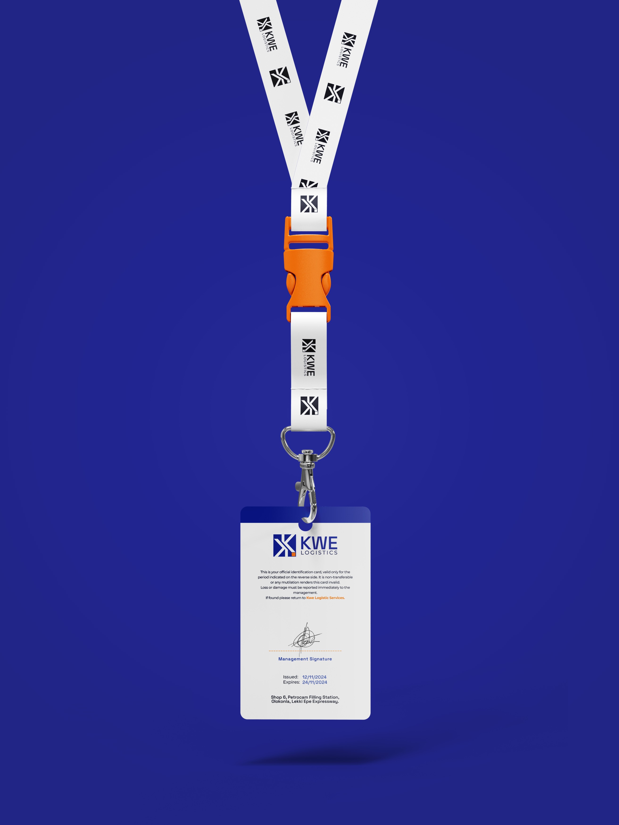
Corporate Identity Tools: Business cards and ID cards to enhance professionalism.
Packaging: branded boxes and tapes to elevate the delivery experience and instill confidence in the customer.
Promotional Items: Stickers and outdoor banners for wider brand awareness.
Vehicle Branding: Eye-catching designs for delivery vehicles, turning them into mobile billboards.
Font
The choice of fonts contributed significantly to the brand’s clean and modern identity.
Space Grotesk: Used for its sleek, geometric style, emphasizing modernity and clarity.
Montserrat: A versatile, professional font that reinforced readability and accessibility across materials.
Marketing Materials: Flyers and Outdoor Banners
To ensure a cohesive brand presence, I designed an array of materials that extended the brand’s identity across all touchpoints.
Staff Shirts: strengthening internal brand culture and external visibility.
Corporate Identity Tools: Business cards and ID cards to enhance professionalism.
Packaging: branded boxes and tapes to elevate the delivery experience and instill confidence in the customer.
Promotional Items: Stickers and outdoor banners for wider brand awareness.
Vehicle Branding: Eye-catching designs for delivery vehicles, turning them into mobile billboards.

Building Trust and Recognition
The final brand identity was met with resounding approval from the client. The new designs communicated speed, security, and reliability—exactly what KWE Logistics Services needed to position themselves as leaders in the Nigerian delivery market.
With a bold logo, cohesive marketing materials, and a consistent visual identity across all platforms, KWE Logistics is now a recognizable and trustworthy brand in their industry. The positive reception from their customers and stakeholders speaks to the success of the design.

Conclusion
This project exemplifies the power of thoughtful design in shaping a brand’s identity and market presence. By understanding the client’s vision and translating it into impactful visuals, I was able to help KWE Logistics Services carve out a distinctive space in a competitive market.

